DDKA
DDKA (Dashboard Design for Key Account) is a project which aimed to help decision makers to monitor sales trends and competitors' situations by a simply process instead of traditional non-digital way.
DDKA
DDKA (Dashboard Design for Key Account) is a project which aimed to help decision makers to monitor sales trends and competitors' situations by a simply process instead of traditional non-digital way.
Overview
👤️ Who
Different hierarchies' leaders - district, city, province, HQ
❓️Why
Digital transformation & hard to find the key metrics of negative situations
🛠️ What
A customization and human-centered dashboard to reach stakeholders' needs from different hierarchies
📄️ Delivery
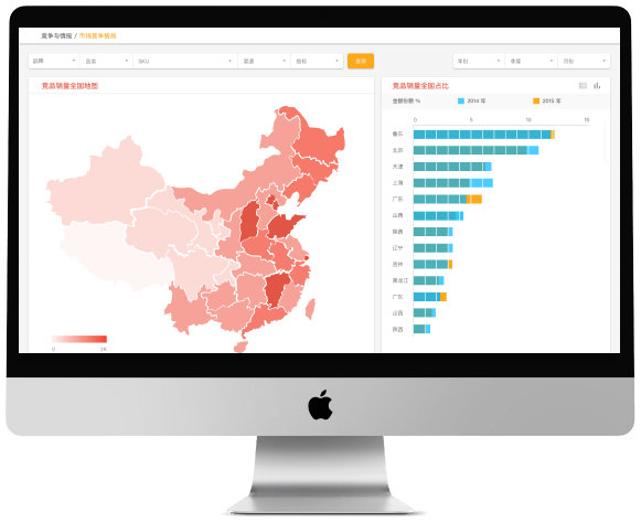
Visual Guideline, Design Tools, Dashboard Design (v1.0)
Designing a user-centered dashboard with a massive data structure for a bunch of stakeholders.
1. Redesign present dashboard and define visual guideline.
2. Design a user-centered dashboard instead of making beautiful user interfaces.
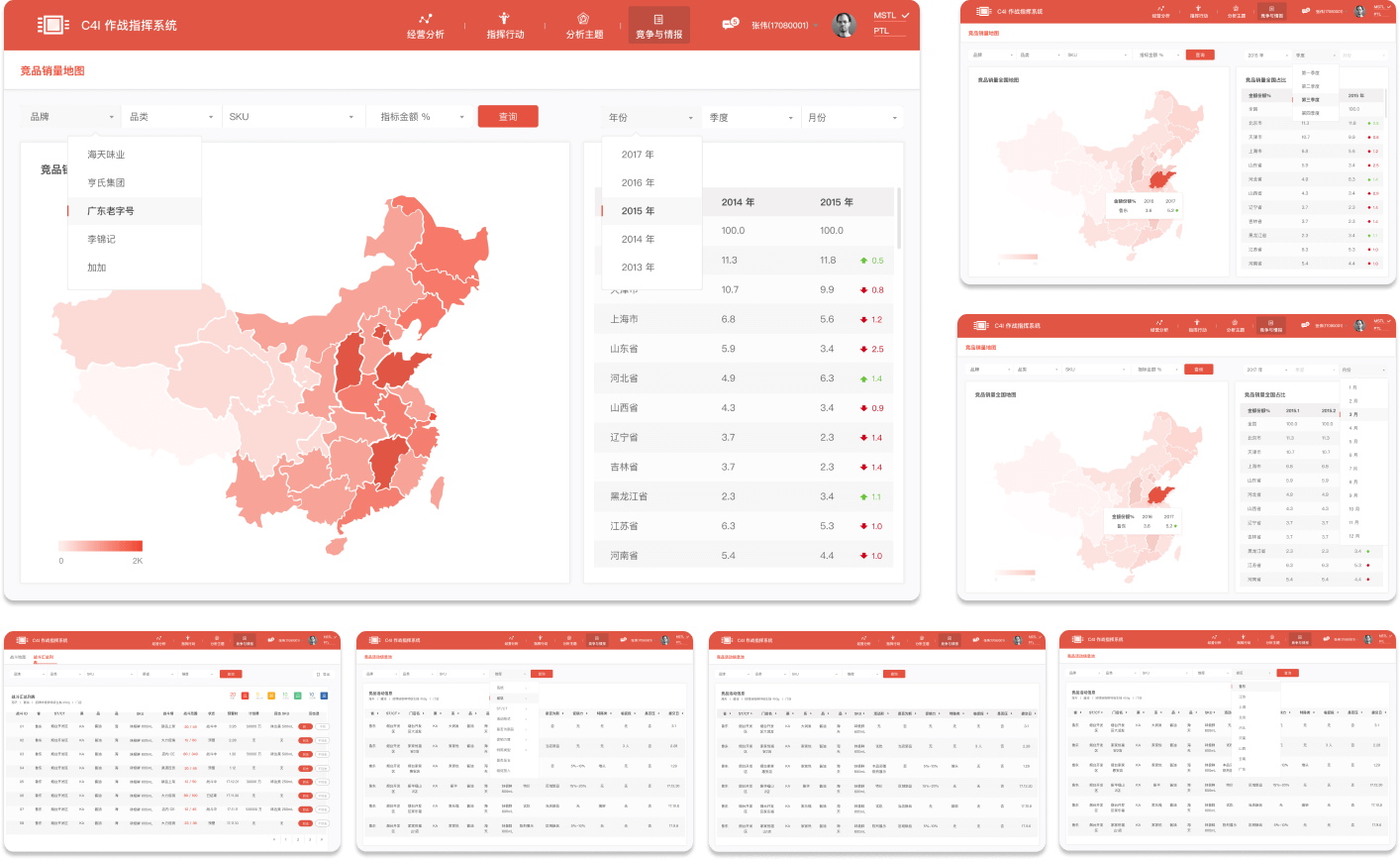
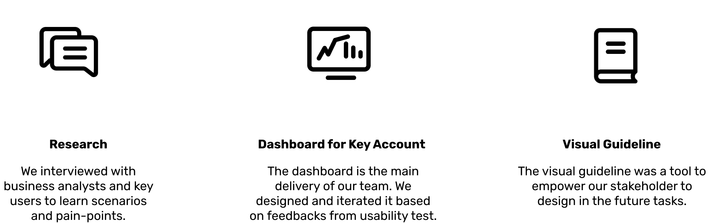
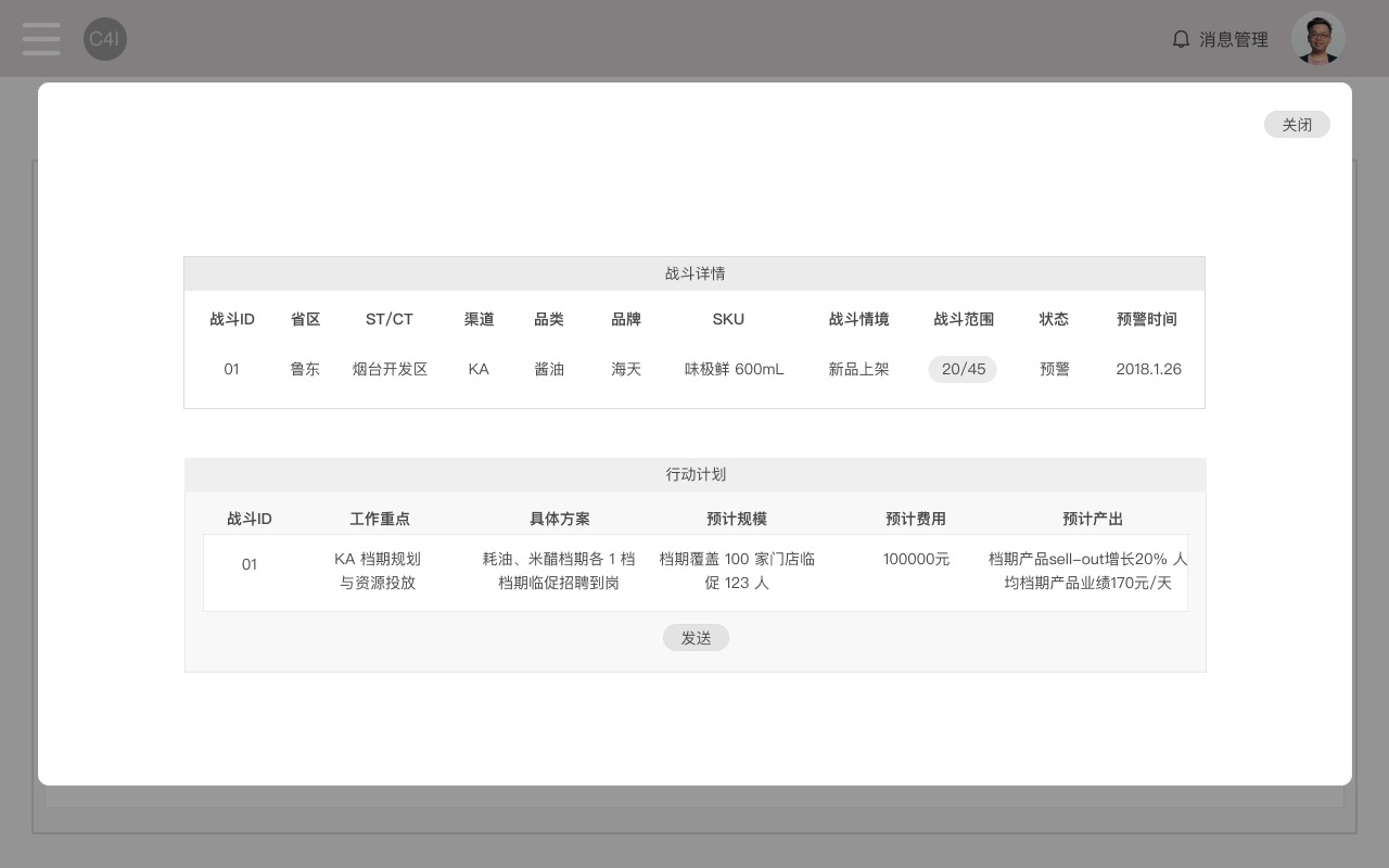
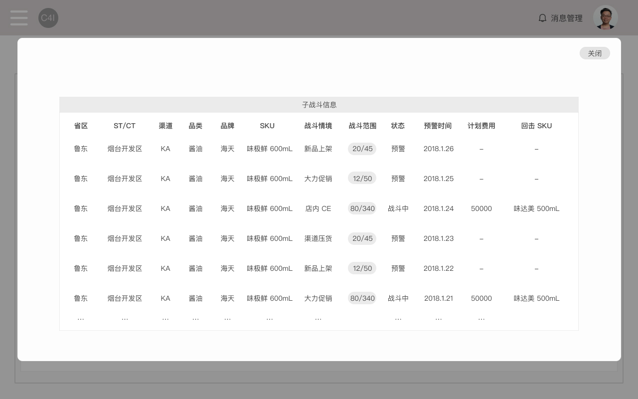
When we found the gap between the user needs and the data required for business decisions, we made a series of attempts to attain a balance, including interviewing the stakeholders to learn about the data requirements and the project background, and focused on one user goal: the sales managers need the dashboard to locate the problem of sales situation and find the minimum operating unit which led to the benefit decrease through the dashboard.
Outcomes
With this goal in mind, we designed the dashboard grid and components, drew some prototypes on paper and used them in the target user interviews. In this way we were able to get first-handed feedback quickly and apply their opinions directly in our design process.
It took us two weeks to design the first dashboard, and another week to initiate 2-3 user tests with 2 sales managers each test. The iteration led us to the most useful and user-friendly dashboard design to our client.
Business Analysis Documents from the 3rd part consultancy.
At the beginning, we learned the consultancy's documents which was analyzed the stakeholder's needs and present business model. We tried to:
1. Sort out dashboards based on thire documents.
2. Analyze key information for different user scenarios.
Based on the strategic planning document from the consultancy, we identified business problems and key users. Through interviewing them, we realized that the dashboard designed by them did not put the user scenarios and into consideration and failed to solve the main pain point: to find the minimum operating unit who is causing the decrease in sales.
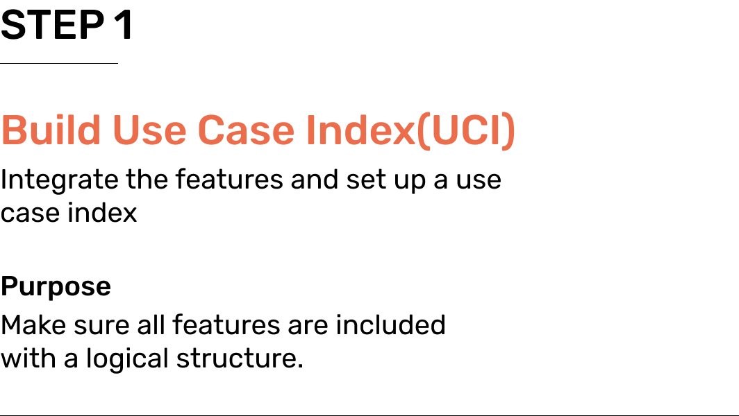
Then, we organized interviews with different stakeholders to learn their real needs. Thus, we got the enough imformation to move on to the User Case Index define.
Lo-Fi Wireframe
We defined the principles to design a user-centered dashboard system at the first.
We also identified the design guideline to follow. We built the grid and explored a couple of layouts to figure out the most suitable one. It was important in the whole process since not only it made our team productive, but also helped every group which were included in this project - the BCG team, the ThoughtWorks team, and our team can cooperate smoothly.
Before the wireframe, we designed the modlues first.
We put the information as real as possible to design the Lo-fi documents. It would be used in the speed interview later.
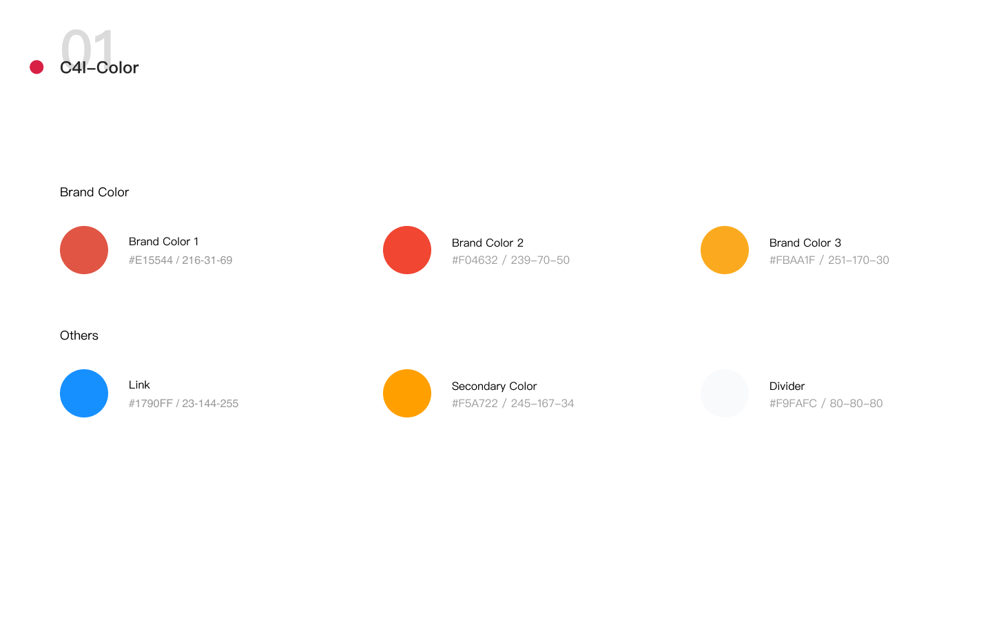
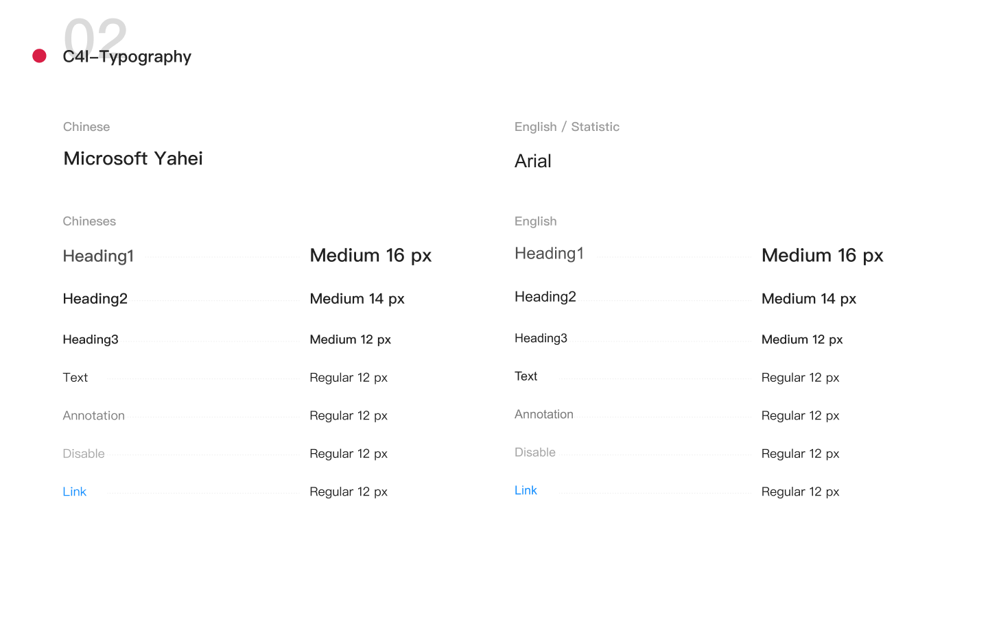
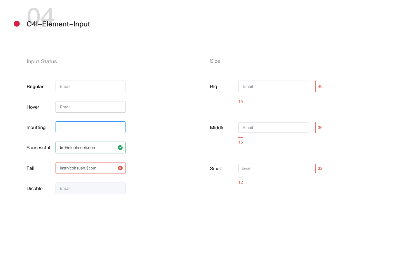
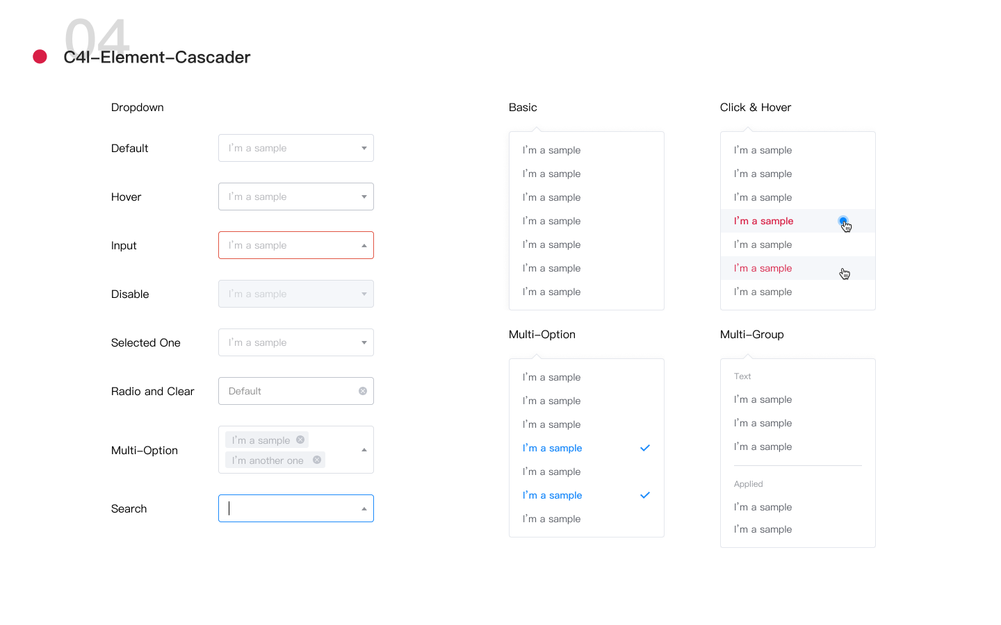
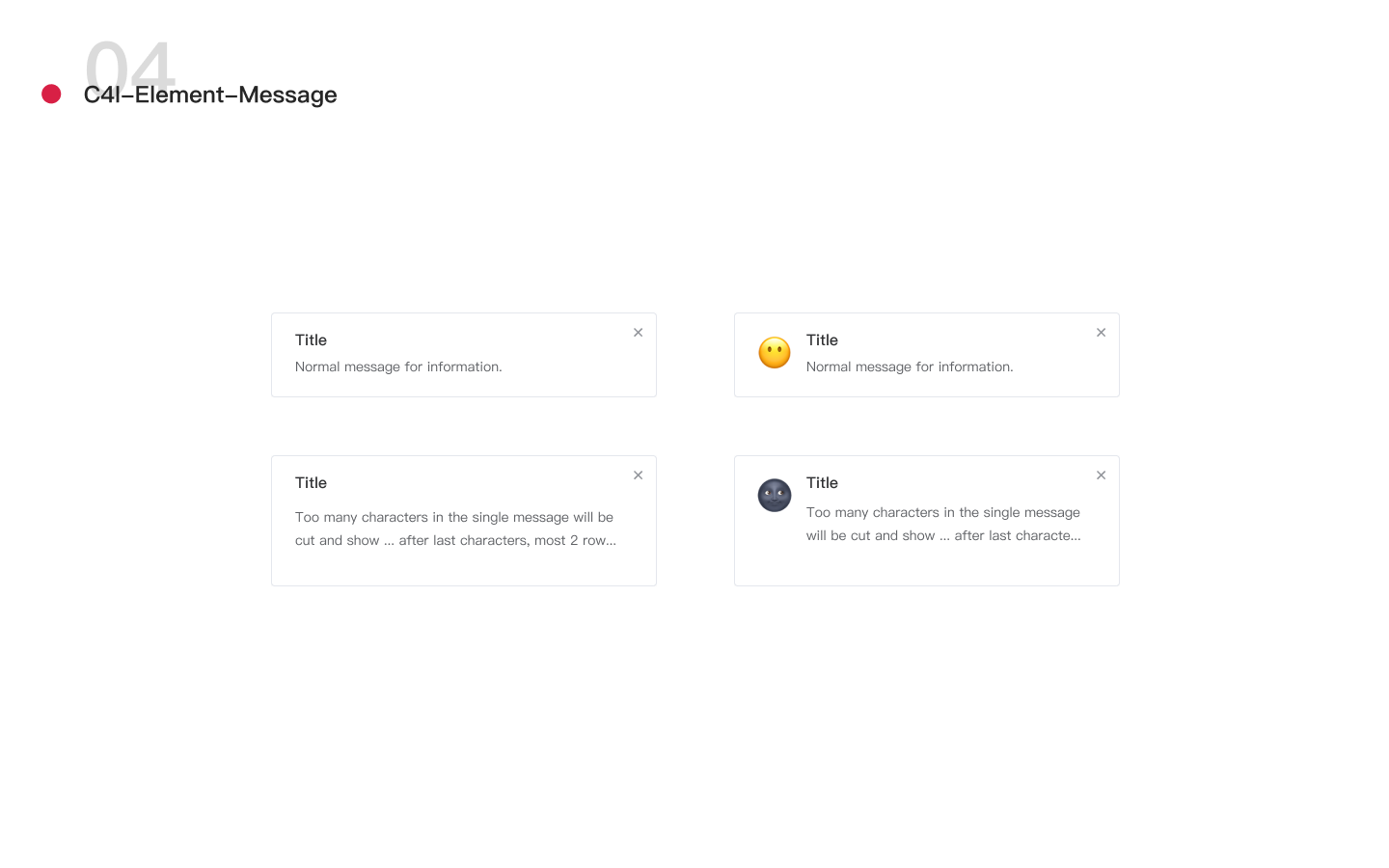
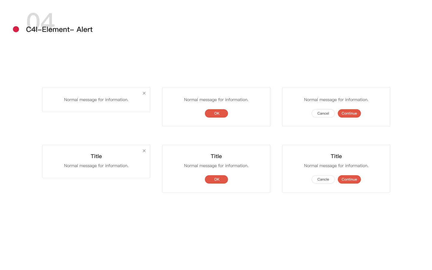
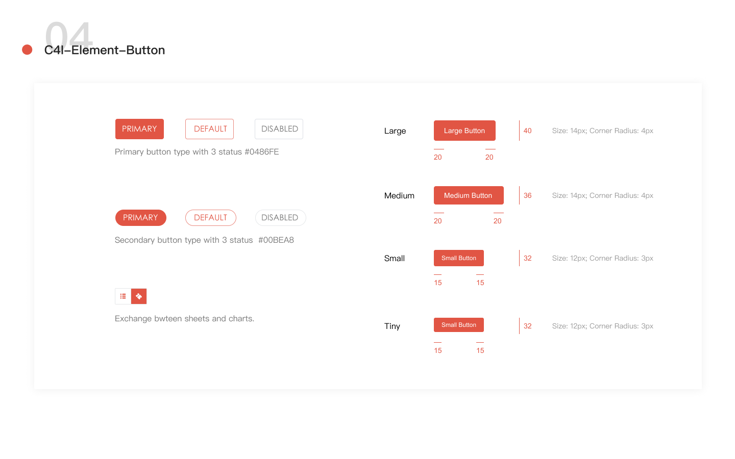
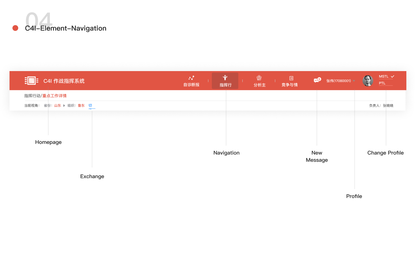
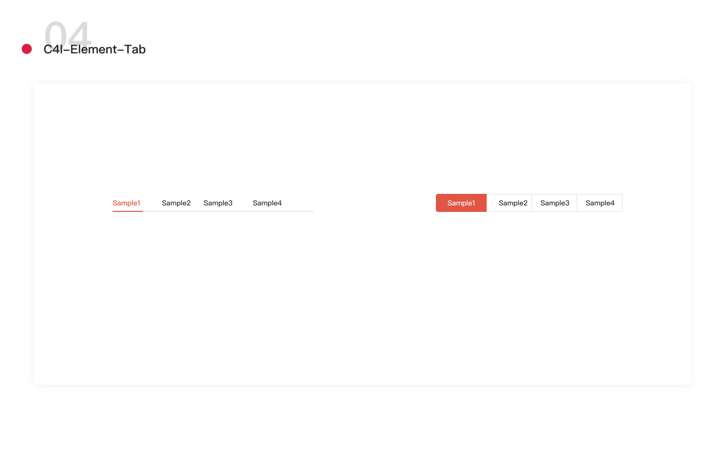
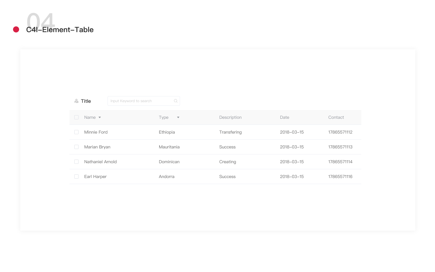
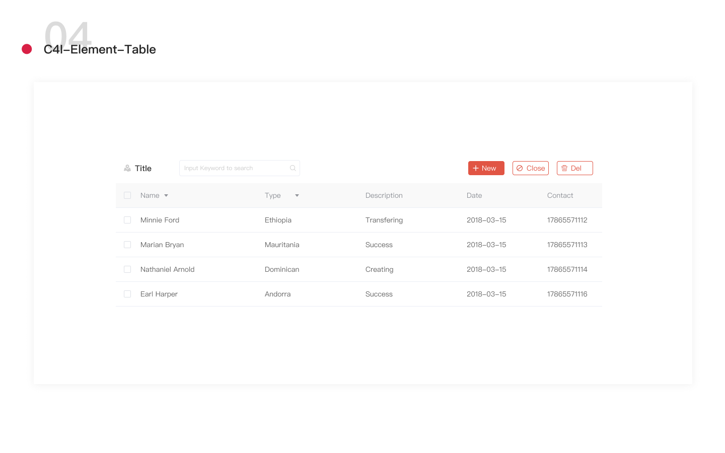
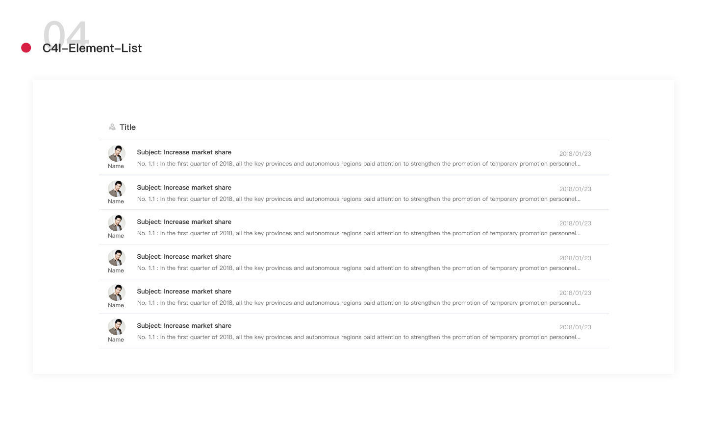
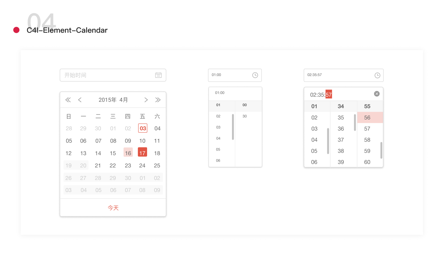
The basic design guidelines, including layout, colors, components and typography, help us create prototypes and arrange user tests more efficiently.
We delivered this visual guideline to our stakeholders and also empowered them on how to use it and design a guideline like this further. Based on the file, the development team began their coding work along with us. Thus, we cooperated in a circle tightly with the guideline.
Except the documents that were mentioned above, we designed interview tools to help us get feedbacks in the interview session. It was like a DASHBOARD LEGO to be used. It was composed of different types of charts, figures, and other components that be defined in our design guideline. The user can put and move any information they think important to them via this tool in a draft dashboard background.
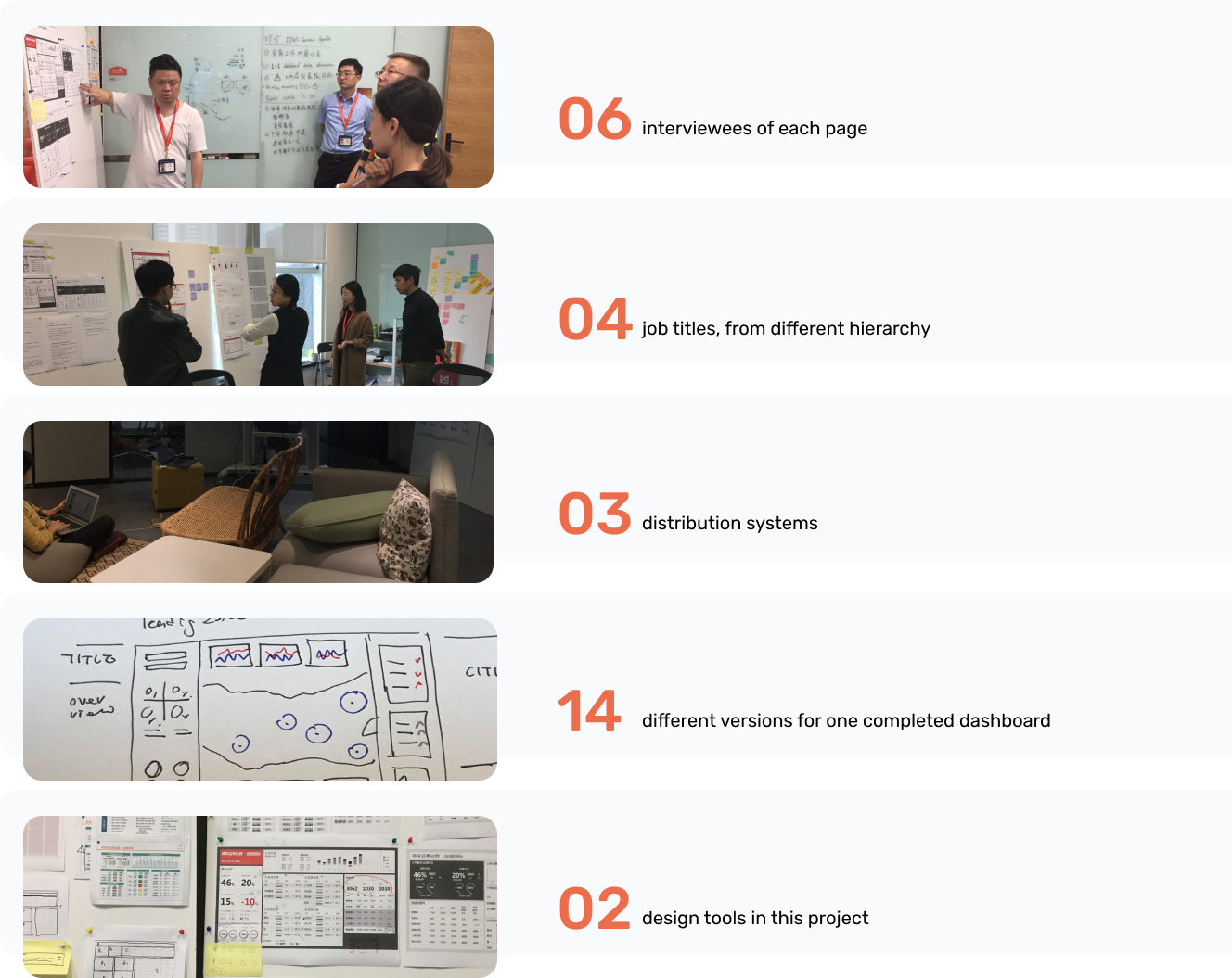
Because the users of the dashboard were from different departments and with various job titles, we have to consider each user's need and through user interviews.
In one week, we talked with 6 people in 4 different job titles, then sorted out their similar and personalized needs. These needs were further discussed and filtered by priority, in order to both finish the first stage of design in time and create a dashboard tailored to each role.
The main users are:
Iterations Based on Feedback
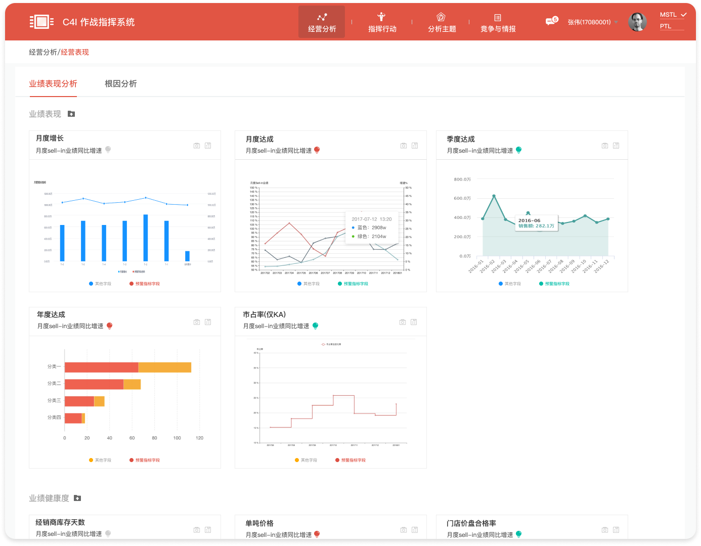
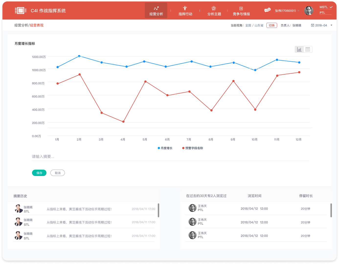
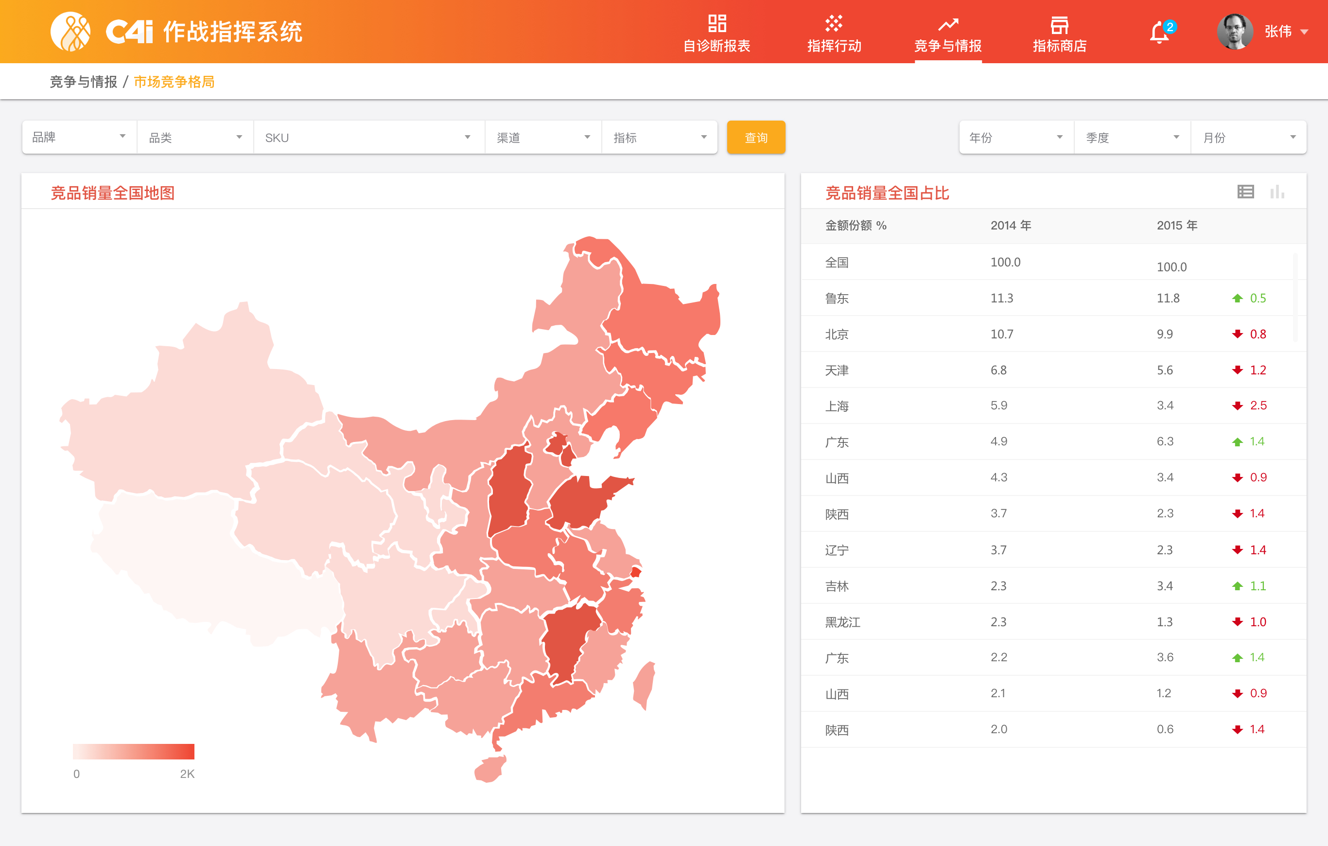
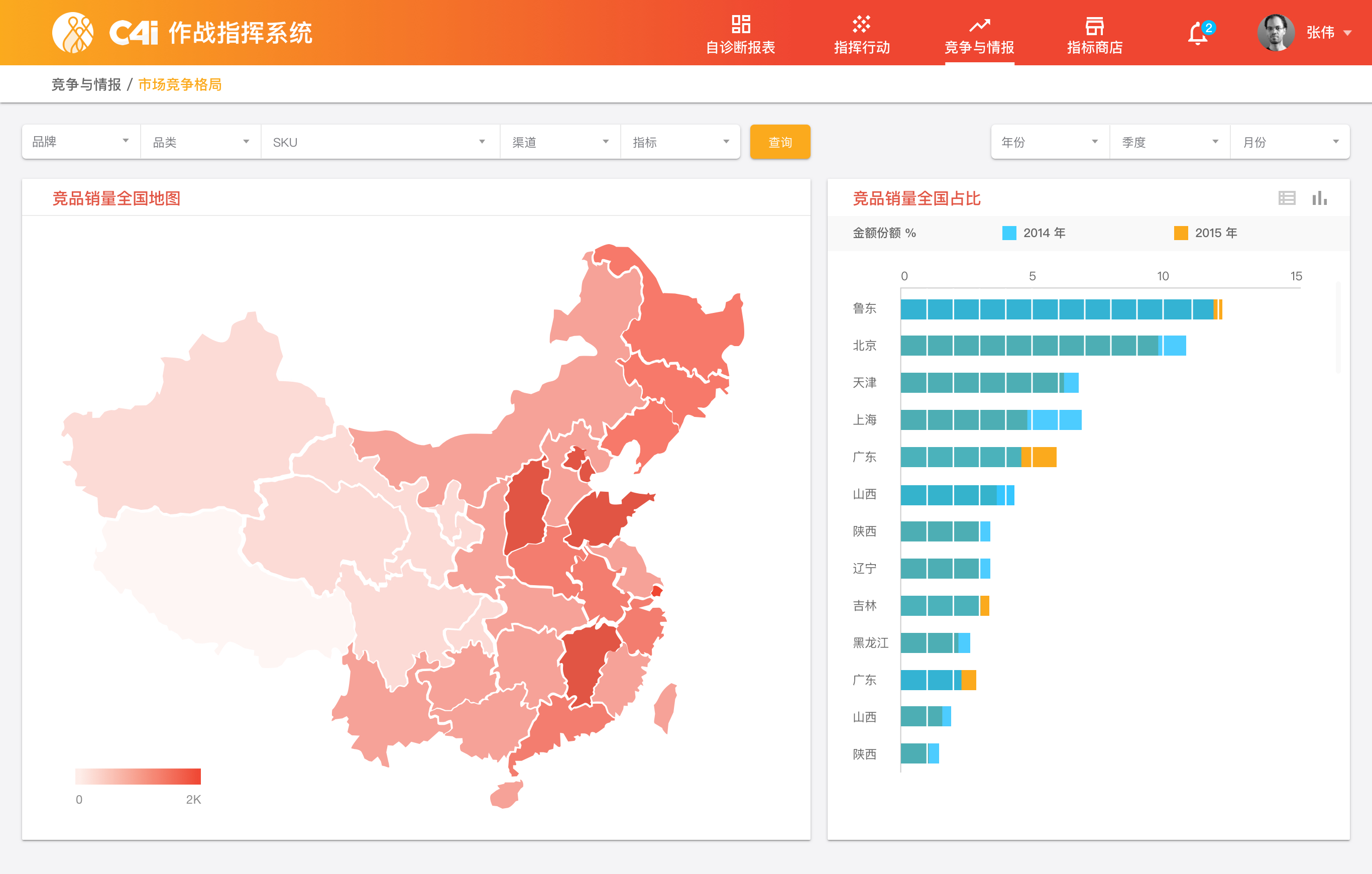
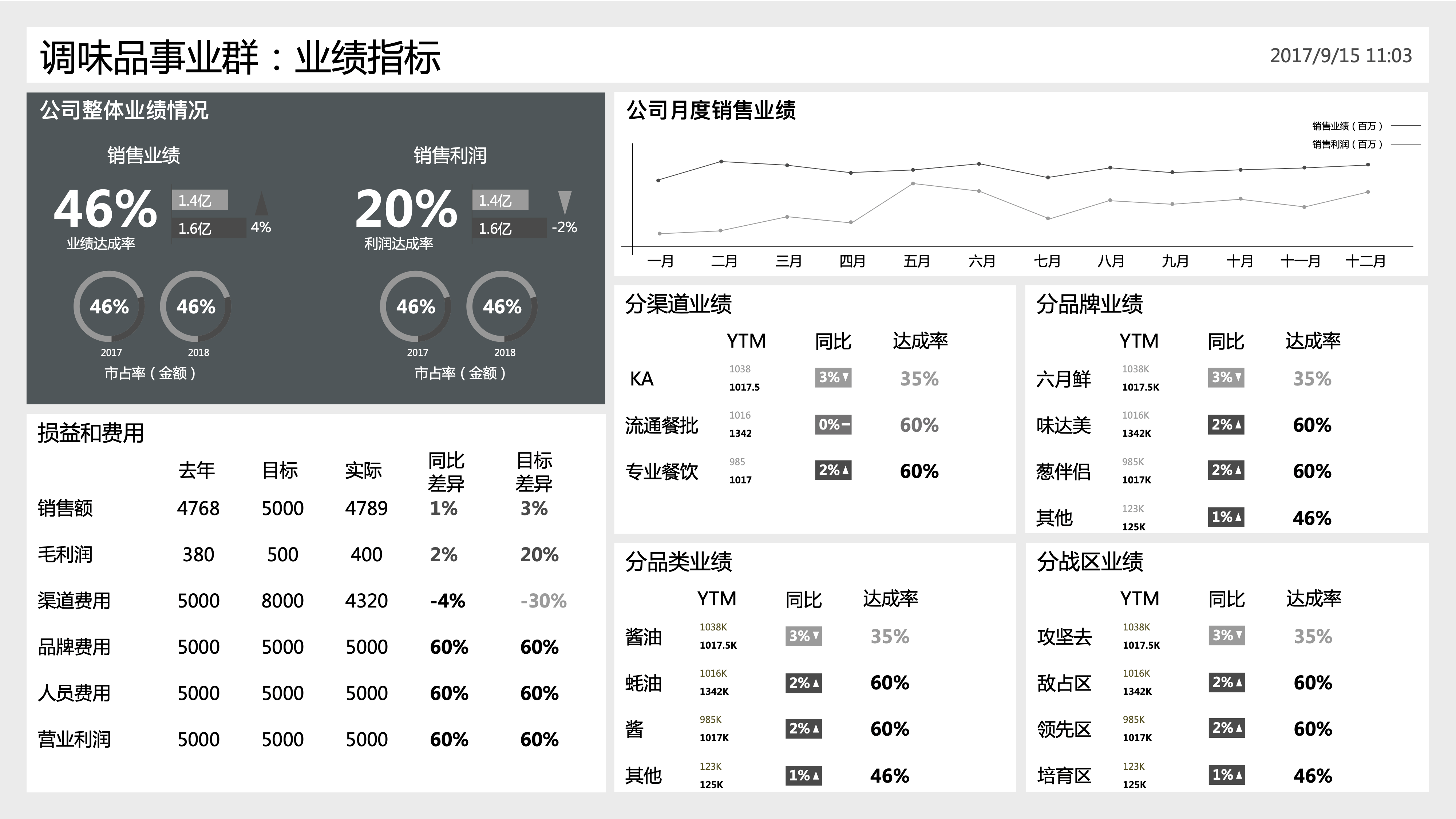
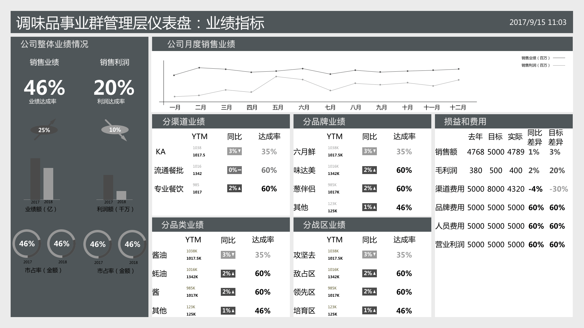
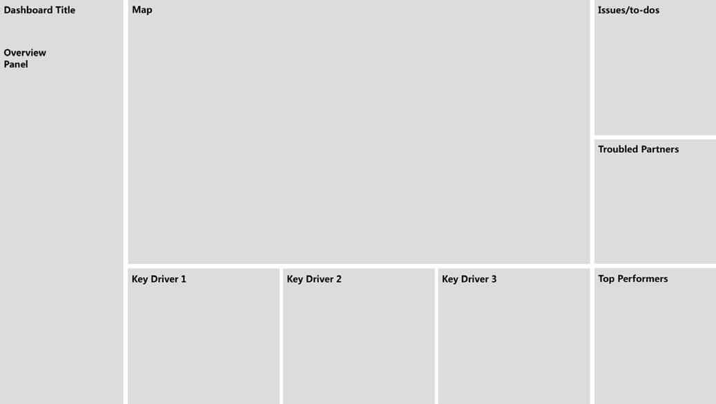
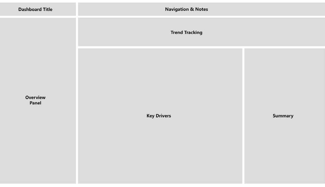
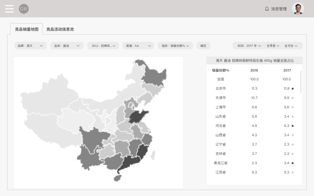
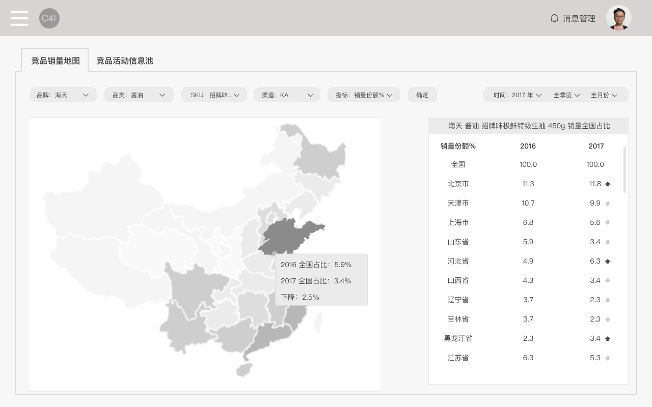
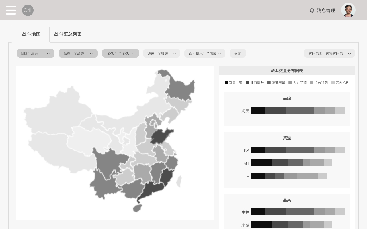
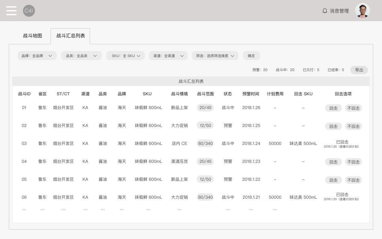
1. Multiple user interviews were conducted for each dashboard's design. In the first interview, key functions were confirmed, leading us to our first prototype based on the consultancy's strategic direction.
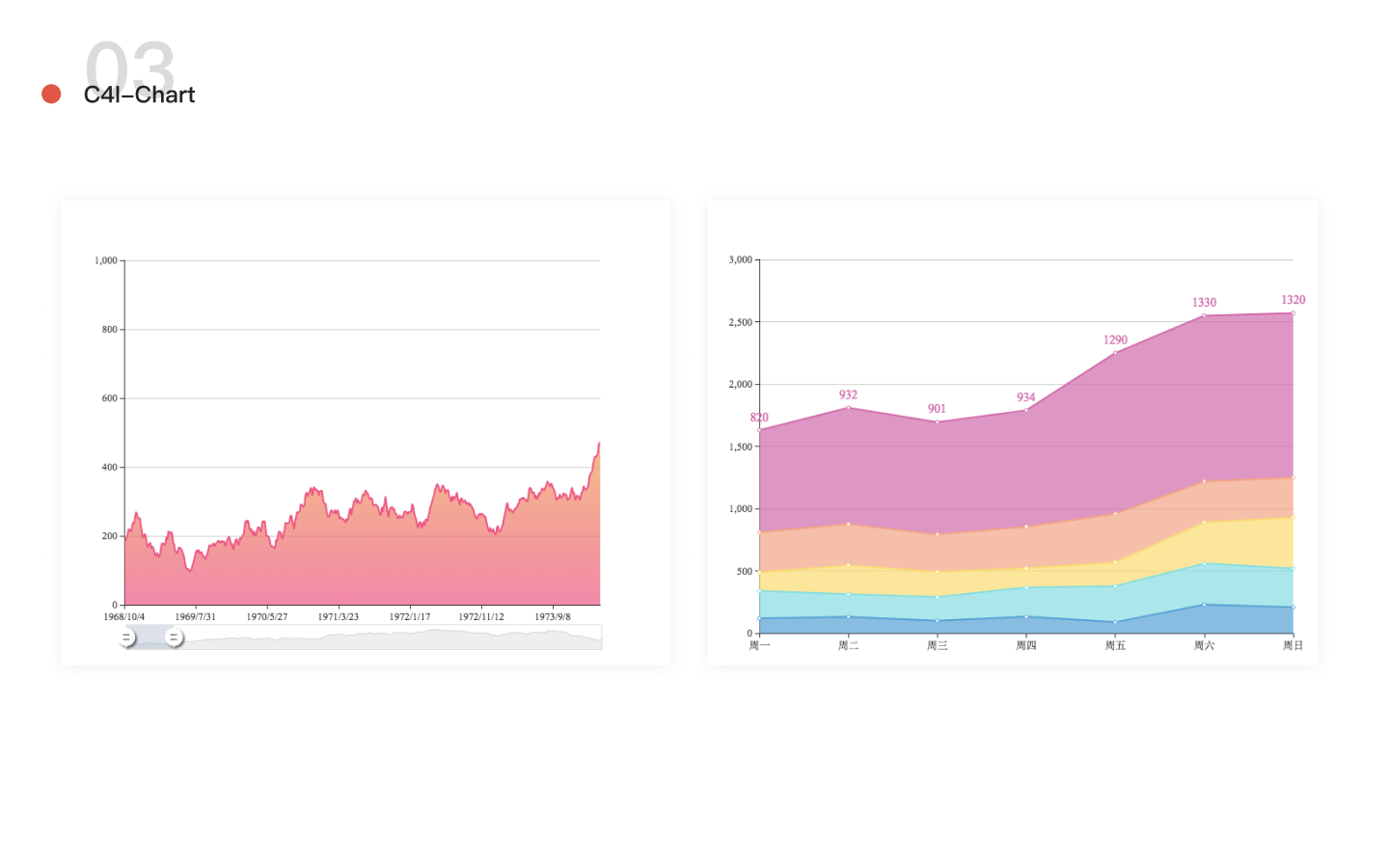
2. After our first prototype, we invited different users for 2 to 3 rounds of interviews to investigate their needs and scenarios, which helped us optimize the layout of the dashboard. Figure 1 and 2 are two design, before and after interviews, respectively. We realized that the data needed by the users were not specific numbers and therefore did not need to be shown as bar graphs. What the users did need was the sales trend over the past two years. With more details in real settings, we did further adjustment in our design to fit in user scenarios.